On 16 July 2026 a new client sent us his brand brief. It was a good one: a logo he had designed himself, three specified colours, five reference sites he admired. We measured the palette before designing a single pixel, and his accent colour failed WCAG 2.2 AA twice over, at 2.59:1 on white. His second colour failed too. His first was one of the best we have ever measured. This post walks through that audit with every number intact, because brand colours accessibility problems are the norm, not the exception: most palettes we are handed contain at least one colour that cannot legally carry text. Here is how we caught this one at kickoff, how the conversation went, and exactly how to test your own colours before they cost you a redesign. The full build story is in the Cordley Solutions case study; this piece is about the method.
A real brand brief: navy, silver and an accent orange
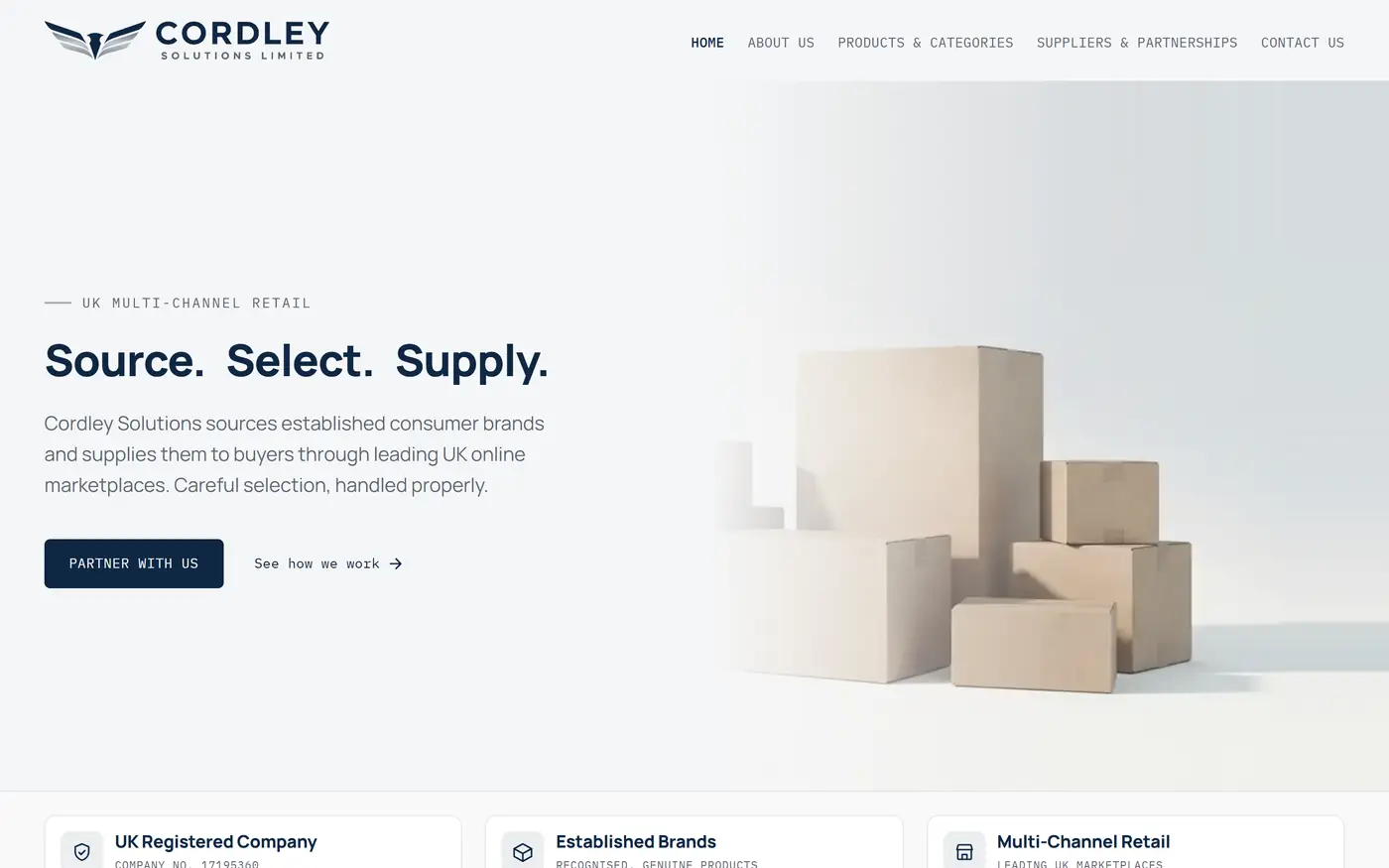
The client was Cordley Solutions, a new UK business that sources established consumer brands and supplies them to buyers through leading online marketplaces, across the household, health and beauty, personal care and FMCG categories. Our contact was Reiss Johnson, one of the two directors named publicly on Cordley's about page. His brief specified three colours: navy #0F2744, silver #8A9199, and an accent orange, #F58220, all sitting on white and off-white grounds.
Standard practice in most studios is to accept the palette and start designing. Contrast problems then surface weeks later, in an audit or a complaint, when every button and heading already depends on the broken colour. I have inherited enough of those sites to know what the late discovery costs: on a typical small-business build, reworking a baked-in palette means touching every component, every image with text in it, and every state of every button. So on our builds the palette goes under the meter on day one, before any design exists to defend.
Twenty minutes of measuring at kickoff changed the whole project. Here is what the meter said.
What WCAG 2.2 actually requires: 4.5:1 for text, 3:1 for UI
Two thresholds in WCAG 2.2 decide whether a brand colour can do real work on a website. Success Criterion 1.4.3 requires body text to have a contrast ratio of at least 4.5:1 against its background at Level AA, relaxing to 3:1 for large text. Success Criterion 1.4.11 requires at least 3:1 for user interface components: button boundaries, form control outlines, focus indicators, the parts of an interface you have to see to use. The W3C's own wording is blunt:
"The visual presentation of text and images of text has a contrast ratio of at least 4.5:1"
W3C, Understanding Success Criterion 1.4.3: Contrast (Minimum), WCAG 2.2
The ratio itself comes from a fixed formula: each colour is converted to a relative luminance value, and the ratio of the lighter to the darker (plus a small constant) gives a number between 1:1 and 21:1. Pure black on pure white is 21:1. Two identical colours are 1:1. The maths is public, which means every claim in this article can be re-checked by anyone in about a minute, and I would encourage you to do exactly that.
Why does a designer's brief so often collide with these numbers? Alistair Duggin, writing on the Government Digital Service accessibility blog, put his finger on it years ago and it has not dated:
"It is lack of awareness that most commonly results in things being inaccessible."
Alistair Duggin, What we mean when we talk about accessibility, GDS Accessibility blog (16 May 2016)
That line changed how I run kickoffs. The clients who hand us failing palettes are not careless; nobody ever showed them the meter. Reiss had made a considered choice of three colours that looked right together on his screen. Nothing in any branding tool he used had warned him that one of them could never legally sit on a button. The failure mode is invisible until you measure, which is the whole argument for measuring first.
The contrast audit results, colour by colour
Here is the kickoff audit table for the palette as briefed, measured on 16 July 2026. Every ratio is reproducible with the checker or the script further down.
| Colour pair | Ratio | AA body text (4.5:1) | UI components (3:1) |
|---|---|---|---|
| Orange #F58220 on white | 2.59:1 | Fail | Fail |
| White text on orange #F58220 | 2.59:1 | Fail | Fail |
| Silver #8A9199 on white | 3.19:1 | Fail | Pass |
| Silver #8A9199 on off-white #F5F6F7 | 2.94:1 | Fail | Fail |
| Navy #0F2744 on white | 15.06:1 | Pass (AAA) | Pass |
| Navy #0F2744 on off-white #F5F6F7 | 13.92:1 | Pass (AAA) | Pass |
| Navy text on orange #F58220 | 5.81:1 | Pass | Pass |
| Darkened orange #B34F00 on white | 5.20:1 | Pass | Pass |
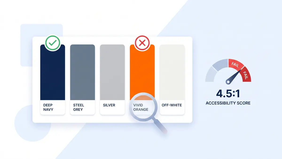
Read the first two rows together and the orange is finished as a working colour. At 2.59:1 it cannot carry text on white and cannot even outline a button, and because contrast is symmetric, white text on an orange fill scores the identical 2.59:1. The single most obvious job for an accent colour, an orange call-to-action with a white label, was not AA-legal before we opened a design tool.
Two rescues existed on paper, and we rejected both. Navy text on orange passes at 5.81:1, but restricting a brand colour to one contrived combination is a workaround hunting for a justification. Darkening the orange to #B34F00 passes at 5.20:1, but at that value it is no longer the colour anyone chose; it reads brown. An accent that has to be disguised before it is usable is not earning its place in a three-colour system.
The silver told a more useful story. At 3.19:1 on pure white it just clears the UI threshold, but the site's ground was an off-white, #F5F6F7, and against that it drops to 2.94:1 and fails everything. This is the trap that catches palettes which were only ever tested against #FFFFFF. The fix came from the client's own logo: its silver wings sit against navy, never against white. So silver became a dark-ground and graphics colour, where it measures 4.73:1 on the navy and passes, and a darker steel grey, #5B6672, was added to carry secondary text on light grounds at 5.41:1. And the navy? 15.06:1 on white, 13.92:1 on the off-white, past the stricter 7:1 AAA bar in both cases. The client's primary colour was, measurably, excellent. We build these audits into every project that comes through our WordPress design service, and it is rare for a briefed palette to score that well.
Measure reference sites, don't describe them

Contrast maths alone rarely wins a palette conversation. A client hears "your colour fails a guideline" and starts negotiating, because the guideline is abstract and the colour is theirs. So we did a second measurement pass, this time on his taste. Reiss had supplied five sites he wanted the design to feel like: LARQ, Ruggable, Patchworks, WatchHouse and Gymshark. Instead of describing them back to him, we drove a headless browser over each one and extracted the computed styles, the actual colour values each site renders, not the ones a style guide claims.
The finding ended the argument before it started. Not one of the five uses an accent orange. Not one uses an accent colour the way his brief imagined at all. Their premium feel is built from restraint: navy or near-black ink, greys, off-white grounds, big type, generous whitespace. Better still, the extraction validated his own choices with uncanny precision. LARQ's navy is #153a5b against his #0F2744. Patchworks' grey is #868f99 against his #8A9199. He had independently picked almost exactly the palette his favourite sites run on.
That reframing is the part of this story worth stealing. The conversation was never "your palette is wrong". It was "your instincts are right, you added one colour too many". Shown the contrast table beside the reference measurements, the client dropped the orange himself, over darkening it, over restricting it, with no pushing from us. Measured evidence did the persuading, and the project moved from brief to a live supplier-facing site in three days with zero palette rework. On a build where every page exists to pass a due-diligence check, right down to the supplier contact route, shipping a measurably accessible two-colour system was also simply the more credible look. We took the same measure-first approach on the removals site ChatGPT scored 99/100: different trade, same discipline.
How to test your own brand colours
You do not need us, or any agency, to run this audit on your own site. The whole thing takes half an hour with free tools. Five steps:
- List every colour pair that will actually render. Body text on your page background. Button labels on button fills. Link colours on white. Border and icon colours on cards. Contrast is a property of pairs, not colours, so a palette is only tested when its combinations are.
- Measure each pair. The WebAIM Contrast Checker is the reference tool: paste in two hex values, read the ratio and the AA/AAA verdicts. Ten pairs takes ten minutes.
- Compare against 4.5:1 and 3:1. Body text needs 4.5:1. Large text and UI components need 3:1. Anything below 3:1 has no legal text or interface job left, only decoration.
- Fix failures by changing the colour's job, or the colour. Darken it until it passes, flip it to a background role with light text, restrict it to graphics and large display type, or drop it. All four are honest; pretending the number is close enough is not.
- Re-test on your real page ground. The silver in our audit passed the UI bar on pure white and failed it on the off-white the site actually uses. Test against what ships.
If you prefer to see the maths rather than trust a tool, the WCAG formula fits in a dozen lines of Python. This is the exact script we ran for the table above:
def channel(c):
    c = c / 255
    return c / 12.92 if c <= 0.03928 else ((c + 0.055) / 1.055) ** 2.4

def luminance(hex_colour):
    h = hex_colour.lstrip('#')
    r, g, b = (int(h[i:i+2], 16) for i in (0, 2, 4))
    return 0.2126 * channel(r) + 0.7152 * channel(g) + 0.0722 * channel(b)

def contrast(a, b):
    la, lb = luminance(a), luminance(b)
    return (max(la, lb) + 0.05) / (min(la, lb) + 0.05)

print(f"{contrast('#F58220', '#FFFFFF'):.2f}:1")   # 2.59:1  fails AA text and UI
print(f"{contrast('#0F2744', '#FFFFFF'):.2f}:1")   # 15.06:1 passes AAA
The output for the client's palette is the table you read earlier, to the decimal. And once the survivors are settled, bake them into the codebase as named tokens with their jobs in the comments, so nobody reaches for the wrong colour in six months. This is the palette block the Cordley build ships:
:root {
  --cdly-navy:      #0F2744;  /* ink, headings, primary CTA fill: 15.06:1 on white */
  --cdly-navy-deep: #071829;  /* footer ground, pressed states */
  --cdly-paper:     #F5F6F7;  /* page ground: cool off-white */
  --cdly-panel:     #FFFFFF;  /* cards lifted off the ground */
  --cdly-silver:    #8A9199;  /* dark grounds and graphics ONLY: 2.94:1 on paper */
  --cdly-steel:     #5B6672;  /* secondary body text on light: 5.41:1 on paper */
}
Notice what the comments do: they record the measurement next to the rule it produced. The silver's 2.94:1 is written into the file as the reason it can never be light-ground text. Documentation that carries its own evidence survives handovers; style guides that just say "use sparingly" do not.
The colour families that usually fail
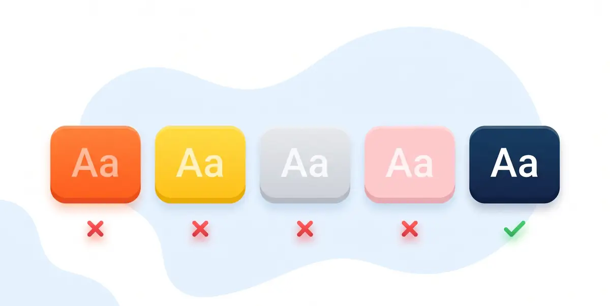
After enough of these audits you can predict the failures before opening the checker. The same families come up on brief after brief:
- Mid-oranges and ambers. The band around #F58220 is too light for white text and too dark for comfortable black text. Almost every "energetic" accent orange in a small-business brief lands here.
- Yellows and golds. Yellow is the highest-luminance hue there is; against white it struggles to reach 2:1. Yellow works as a highlight block behind dark text, never as text.
- Mid-greys and silvers. The "subtle" text grey is the most common failure on the web. Our client's #8A9199 at 2.94:1 on off-white is typical. If your secondary text colour looks elegant, measure it.
- Pastels. Soft pinks, mints and sky blues carry white text on countless hero banners at ratios under 2:1. They belong behind dark ink or in illustrations.
- Brand blues that are almost dark enough. Plenty of corporate blues sit at 3.5:1 to 4.3:1 on white, passing for large headlines and failing for body text. These are the sneakiest, because they look fine to a well-sighted eye.
Deep navies, forest greens, aubergines and near-blacks, by contrast, pass almost anything you ask of them. It is not a coincidence that the premium end of e-commerce design keeps converging on dark ink plus off-white: the palette that photographs as restraint is also the palette that measures as accessible.
Why contrast failures cost you customers
The business case does not need inflating, because the population numbers do the work. GOV.UK's service manual states that 1 in 5 people in the UK have a long-term impairment affecting their ability to do everyday activities. On colour vision specifically, Colour Blind Awareness puts colour vision deficiency at around 1 in 12 men and 1 in 200 women, roughly 3 million people in the UK. And low contrast degrades gracefully for no one: it is the same failure whether the cause is low vision, a cheap screen, or sunlight on a phone in a car park. A button label at 2.59:1 is not a niche problem. It is a percentage of every audience you will ever pay to acquire, bouncing off a control they cannot comfortably read.
There is a legal floor under this too. UK public sector websites are required to meet WCAG 2.2 AA under the Public Sector Bodies (Websites and Mobile Applications) (No. 2) Accessibility Regulations 2018, and for private businesses the Equality Act 2010 requires reasonable adjustments so disabled customers are not put at a substantial disadvantage. Meeting WCAG AA is the accepted evidence that a website clears that bar. The principle behind all of it was set out by the man who invented the medium:
"The power of the Web is in its universality. Access by everyone regardless of disability is an essential aspect."
Tim Berners-Lee, inventor of the World Wide Web, quoted by the W3C Web Accessibility Initiative
I keep coming back to that quote because of what it did to my sense of where accessibility sits in a project. It is not a compliance chore bolted on before launch; it is a property of the medium we build in, the same way load-bearing walls are a property of buildings. Once you hold that frame, testing a palette at kickoff stops feeling like extra process and starts feeling like the minimum professional standard, no different from publishing honest content Google can trust. The machine readers matter here too: the Cordley build shipped its measured palette alongside full structured data and the nine AI Discovery Files from the AI Discovery Files specification, and you can check any site's machine-readable layer with the free AI Visibility Checker. Human readers get legible buttons, machine readers get verifiable facts, and both are the same habit: make the site checkable.
Where the rules ease off: logos, large text and flipped roles
An honest guide has to mark the boundaries of its own advice, so here is where the thresholds really do not apply, and where dropping a colour would be an overreaction.
First, logos are exempt. Under SC 1.4.3, text that is part of a logo or brand name has no contrast requirement. Cordley's silver-winged mark needed no rescue, and your low-contrast logotype does not either. The exemption stops at the logo's edge, though: the moment the same colour styles a heading or a button, the thresholds apply in full.
Second, large text has a lower bar. At roughly 24px regular or 18.5px bold and above, 3:1 passes AA. A colour that fails for body copy can be fine for a big display headline, which is exactly the pattern one of the client's reference sites uses: colour on a few words of display type, never on UI. Decorative elements and disabled controls are also outside the rules entirely.
Third, a failing colour often just needs a different job. Flip it to a background with white or dark text on top, or reserve it for illustration. The silver in this audit survived that way, and so can most "failed" brand colours. Dropping the orange was the right call for this client because three separate arguments converged on it: the maths, the rework the two workable-but-contrived combinations would invite, and five reference sites that showed his taste already ran on two colours. When only the maths argues for deletion, restriction usually wins instead. If most of your palette fails on every ground it renders on, that is a different conversation, and probably a rebuild-level one.
One more limitation, ours this time: contrast is the start of colour accessibility, not the end of it. Never using colour as the only signal for meaning (SC 1.4.1), visible focus states, and testing with real assistive technology all sit beyond what this post covers. Passing the two contrast criteria makes you legible; it does not yet make you fully accessible.
Frequently Asked Questions
What contrast ratio does WCAG 2.2 require for text?
At least 4.5:1 between normal body text and its background, under Success Criterion 1.4.3 at Level AA. Large text (roughly 24px regular or 18.5px bold and above) can drop to 3:1. The stricter AAA level asks for 7:1 on body text. User interface components such as button borders and form control outlines need at least 3:1 under Success Criterion 1.4.11.
How do I check if my brand colours pass accessibility?
Put each foreground and background pair your site actually renders through the free WebAIM Contrast Checker: enter the two hex values and it reports the ratio with pass or fail marks for WCAG AA and AAA. Test real pairs, including text on your true page background rather than pure white, and button labels on button fills. A whole palette takes about ten minutes.
What should I do if a brand colour fails the contrast check?
You have four honest options: darken it until it passes, flip it into a background role with light text on top, restrict it to graphics and large display type where the thresholds are lower or absent, or drop it. On the audit in this article the client chose to drop his failing orange, because darkening it to a passing #B34F00 turned it brown and none of his own reference sites used an accent colour at all.
Do logos have to meet WCAG contrast requirements?
No. WCAG 2.2 exempts logotypes: text that is part of a logo or brand name has no contrast requirement under Success Criterion 1.4.3. That is why a low-contrast mark can be fine while the same colour fails as body text or on a button. The exemption covers the logo itself, not your interface, so you cannot extend it to headings, links or CTAs.
Why does white text on an orange button fail accessibility?
Because contrast is symmetric: orange against white measures the same ratio whichever one is the text. The orange in this audit, #F58220, is 2.59:1 against white in both directions, well short of the 4.5:1 that AA requires for a button label. Mid-oranges sit in a luminance band that is too light for white text and too dark for black text to be comfortable, which is why so many orange CTAs fail.
Is colour contrast a legal requirement for UK websites?
For UK public sector websites, yes: the Public Sector Bodies (Websites and Mobile Applications) (No. 2) Accessibility Regulations 2018 require WCAG 2.2 AA, which includes the contrast criteria. Private businesses are not bound to WCAG by name, but the Equality Act 2010 requires reasonable adjustments so disabled people are not put at a substantial disadvantage, and meeting WCAG AA is the accepted way to evidence that for a website.
How many people are affected by poor colour contrast?
More than most palettes assume. GOV.UK's service manual states that 1 in 5 people in the UK have a long-term impairment affecting their ability to do everyday activities. On colour specifically, Colour Blind Awareness puts colour vision deficiency at about 1 in 12 men and 1 in 200 women, roughly 3 million people in the UK. Low contrast also hurts everyone reading a phone in sunlight.
Can I keep a brand colour that fails WCAG?
Often, yes, by changing its job rather than its value. A failing colour can still work as a background with white or dark text on top, as a graphic or illustration colour, or in large display type where the threshold drops to 3:1. On this audit the client's silver failed on light grounds at 2.94:1 but passed on navy at 4.73:1, so it became a dark-ground and graphics colour instead of being removed.
Want your palette measured before it costs you?
Every design project we take on starts with the audit in this article: contrast-testing the brief, measuring the reference sites, and settling the palette on evidence before a pixel is drawn. If your brand colours have never been under the meter, we will put them there.
See our web design servicesPublished: 22 July 2026 · Last reviewed: 22 July 2026 · Written by: Mark McNeece, Founder & Lead Developer, Press Forge
Editorially reviewed by: Mark McNeece on 22 July 2026 · Our editorial standards
Sources
- Understanding SC 1.4.3: Contrast (Minimum) - W3C, WCAG 2.2
- Understanding SC 1.4.11: Non-text Contrast - W3C, WCAG 2.2
- Web Content Accessibility Guidelines (WCAG) 2.2 - W3C Recommendation
- Introduction to Web Accessibility - W3C WAI (the Tim Berners-Lee quote)
- Contrast Checker - WebAIM
- Making your service accessible: an introduction - GOV.UK Service Manual (the 1 in 5 figure)
- Understanding accessibility requirements for public sector bodies - GOV.UK
- What we mean when we talk about accessibility - Alistair Duggin, GDS Accessibility blog
- About Colour Blindness - Colour Blind Awareness
- Cordley Solutions - the client site (check the shipped palette yourself)
- Cordley Solutions case study - the full build write-up, including this audit
- Wholesale distribution website design - our sector page for this kind of build